I recently had the opportunity to present at the 14th Belgian Python User Group (PUG) meetup. The event was kindly hosted by Datashift at their offices in Mechelen on January 22, 2026.
It was a fantastic evening of technical deep-dives and community networking. You can view the original meeting announcement and attendee list on Meetup.
The meetup featured three insightful sessions covering data engineering, project structure, and environment management:
Session 1: A modern data stack demo across engineering, quality, governanceBy Arnaud Gueulette A hands-on demonstration of integrating leading DataOps and Data Governance tools to automate quality checks and orchestrate transformations.
Session 2: A modern template for Python projects (Python Minimal Boilerplate)By Lode Nachtergaele I presented the rationale behind my template, which focuses on modern tools like uv, ruff, ty, logfire, and zensical to create a streamlined developer experience.
Session 3: From venv to isolated application directory: why virtualenvs are not enoughBy Wouter Vanden Hove A talk packed with tips and tricks from 20 years of experience on maintaining robust, isolated Python applications.
Below are the slides from my talk. I discuss why a "minimal" boilerplate is essential for modern Python development and how it leverages the latest tools in the ecosystem.
The template is publicly available on GitHub. It is designed to be a "frictionless" starting point for any new Python project, ensuring you have the best tools configured from day one.
Some of the smartest people working on AI disagree about where it is going. Not just on timelines, but on fundamentals. Some argue that progress will slow because we are hitting physical limits. Others believe that new breakthroughs will unlock systems far more general than anything we have today. Still others argue that the very idea of “superintelligence” is a distraction.
For a long time, I found this disagreement confusing. These are people with access to the same research, the same models, and often the same data. If anyone should agree about the future of AI, it should be them.
Over time, I started to suspect that the disagreement wasn’t really about technology.
It was about what counts as success.
When people talk about AI “winning,” they often mean different things. Sometimes they mean being first. Sometimes they mean being most capable. Sometimes they mean building something that looks impressive on a benchmark or in a demo. These goals are easy to measure, and they dominate public discussion.
They are also insufficient.
For me, advanced AI is only a success if three things are true:
its benefits are broadly shared rather than concentrated,
it makes human work more rewarding instead of hollowing it out,
and it can exist within real physical and ecological limits.
Once I started looking at the AI debate through this lens, many disagreements made more sense. People weren’t talking past each other because they misunderstood the technology. They were optimizing for different outcomes.
This essay is an attempt to understand those differences—not to predict who will be right about AGI, but to ask a more practical question: how should organizations act when the technology is powerful, the future is uncertain, and the consequences are unevenly distributed?
Once you define success this way, the disagreement around AI becomes easier to interpret. The question is no longer who is right about the future, but what each group is trying to optimize for.
This becomes especially clear when you look at a small number of influential voices—not as prophets, but as representatives of distinct strategies. Each is responding to the same technological reality. Each sees real risks. Where they diverge is in what they believe should be maximized, and what they believe must be constrained.
Understanding these differences matters, because organizations often copy the assumptions of the loudest or most successful players without realizing it. Before adopting their tools or their rhetoric, it is worth understanding the world they are implicitly trying to build.
Dan Wang approaches the future of AI from a geopolitical angle. In his book Breakneck: China’s Quest to Engineer the Future, the central question is not what intelligence is, but how technological capability translates into national power.
Wang’s core observation is simple: China and the United States are locked in a competition where speed matters. Not just speed of invention, but speed of deployment. The advantage does not necessarily go to whoever builds the most elegant system, but to whoever can turn new capabilities into real-world infrastructure fastest.
China, as Wang describes it, excels at this. Once a technology is deemed strategically important, it can be rolled out at scale, embedded into institutions, and iterated on quickly. The United States, by contrast, tends to lead in early research but often struggles with coordination and diffusion.
What matters is that Wang’s argument does not depend on AGI arriving soon—or at all. Even narrow or imperfect AI systems can have enormous impact if they are widely deployed and tightly integrated into society.
This leads to a very specific definition of success: whoever aligns technology, institutions, and incentives most effectively will win.
From this perspective, questions about distribution, meaningful work, or sustainability are secondary. They may matter socially or politically, but they are not the primary drivers of the strategy.
Wang describes the world as it is. And it is against this reality—of competition, pressure, and uneven incentives—that the other perspectives react.
If Wang represents speed, Tim Dettmers represents constraint.
In his essay Why AGI Will Not Happen,
Dettmers argues that the current AI strategy—relentless scaling through more compute, more energy, and more capital—runs into physical and economic limits much sooner than most narratives admit.
Computation is not abstract. It happens on chips that consume power, generate heat, and depend on complex supply chains. For a long time, progress felt almost free. Bigger models reliably worked better. Hardware improved predictably. Capital was abundant.
Dettmers argues that this era is ending. Linear gains now require exponential resources, and that trajectory cannot continue indefinitely.
This matters because “speed at all costs” assumes scaling is always available as an option. Dettmers challenges that assumption. If compute, energy, and money become binding constraints, then racing faster becomes a gamble rather than a strategy.
There is also an implicit sustainability argument here. Even if massive scaling were technically possible, it raises questions about environmental impact and opportunity cost.
Dettmers does not claim that AI development will stop. His point is more uncomfortable: the easiest path forward is narrowing, and organizations built on assumptions of unlimited growth may find themselves brittle.
Where Dettmers sees constraints, Ilya Sutskever sees a fork in the road.
Sutskever has openly stated that the era of effortless scaling is ending, but he does not conclude that progress must therefore stall. Instead, he argues that limits signal the need for conceptual breakthroughs.
Past progress in AI has not come from scaling alone. Backpropagation, convolutional networks, transformers—each reshaped what scaling even meant. In hindsight they look obvious. At the time, they were not.
This belief explains his focus on long-term research and safety, most recently through Safe Superintelligence Inc..
What distinguishes this view is its combination of ambition and restraint. Sutskever takes the possibility of extremely powerful systems seriously—and precisely because of that, treats alignment and safety as prerequisites rather than afterthoughts.
For organizations, this suggests a different posture toward uncertainty: build the capacity to adapt, rather than optimizing prematurely for today’s dominant paradigm.
If Sutskever believes the curve can bend, Yann LeCun questions whether there is a single curve at all.
LeCun has long argued that the AGI and superintelligence debate rests on a flawed abstraction: the idea that intelligence is a single scalar quantity that can be increased and extrapolated.
In reality, intelligence is multi-dimensional. Systems can excel in some areas while remaining weak in others. Asking whether one system is “more intelligent” than another is often as misleading as asking whether a hammer is smarter than a screwdriver.
LeCun is particularly skeptical that scaling language models leads naturally to world understanding. Language, he argues, is a surface phenomenon. Much of human intelligence is grounded in perception and interaction with the physical world.
This reframing dissolves both runaway optimism and hard ceilings. If intelligence is not one-dimensional, there is no single curve to race along.
For organizations, the implication is quiet but radical: there is no finish line—only choices.
Taken together, these perspectives do not converge on a single prediction. They converge on something more useful: a way to think about action under uncertainty.
Wang reminds us that technology is deployed as soon as it exists.
Dettmers reminds us that scaling faces real limits.
Sutskever argues that breakthroughs can change the curve.
LeCun questions whether the curve metaphor even applies.
What unites them is this: the future will not be linear.
If inequality from AI is an organizational and institutional issue, then the most important choices are not technical. They are structural.
Three principles follow:
Avoid irreversible bets.
Preserve human agency where values are involved.
Invest in understanding, not just usage.
These principles work whether progress accelerates, slows, or fragments.
It is tempting to ask who will win the AI race. That question is simple, and it feels urgent. It is also the wrong one.
The systems we are building will be powerful whether or not we ever agree on what AGI means. What matters is not how impressive they become, but how they are woven into institutions, work, and daily life.
This essay itself was written with the help of AI. Not as a substitute for judgment, but as a tool for thinking. The responsibility for the conclusions—and for their consequences—remains human.
Used this way, AI does not diminish meaningful work. It supports it.
The future will not ask whether we were clever enough to build powerful machines.
It will ask whether we were wise enough to use them well.
These new coding agents—along with Cursor, Lovable, Windsurf, V0, Bold.new, and others—are all tools that support some form of “vibe coding” (a term coined by Karpathy indicating AI-assisted coding).
This gives rise to a lot of FUD (fear, uncertainty, and doubt) from the corporate gatekeepers. The short-term opportunity is this: in a design thinking approach, a “research prototype” that checks the basic hypotheses (who is this product for, what problem does the product solve) can be developed much faster using vibe coding.
Even with the expected “valley of disappointment” that may follow (because users tend to overreact to the initial prototype, which will likely need to be rewritten from scratch), in the end, the chance of building a product that resonates with users is much higher and it will be ready sooner—if the same good old software process is followed, from prototype to Minimum Viable Product (MVP) to Version 1 accepted by users.
Deepseek: after they pulled of DeepSeek V3, Deepseek released open model DeepSeek-Prover-V2 that tackles advanced theorem proving achieving an 88.9% pass rate on the MiniF2F-test benchmark (Olympiad/AIME level theorems) and solving 49 out of 658 problems on the new PutnamBench. This means that Deepseek is cracking the reasoning part of LLM's.
And OpenAI:
Let us make Gibli images
We are not Open anymore because we need to much VC budget. Euhm, actually we want to be open again and let's hire instagram CEO to clean up our mess
Here's GPT4.5 preview, euhm, actually GPT 4.1 is better....
The chart looks quit similar to the original. Biggest difference is the typography. The Financial times uses its own Metric Web and Financier Display Web fonts and Altair can only use fonts available in the browser.
For the moment the font does not look at all to be Metric web :-(
A second minor difference are the alignment of the 0.0 and 3.0 labels of the x-axis. In the orginal, those labels are centered. Altair aligns 0.0 to the left and 3.0 to the right.
alt.Chart(df).mark_bar().encode(x='Average number of likes per Facebook post 2016:Q',y='Page:O')
The message of the graph is that Jerermy Corbyn has by far the most likes per Facebook post in 2016. There are a number of improvements possible:
The number on the x-axis are multiple of thousands. In spirit of removing as much inkt as possible, let's rescale the x-asis with factor 1000.
The label 'Page' on the y-axis is superfluous. Let's remove it.
df['page1k']=df['Average number of likes per Facebook post 2016']/1000.0
After scaling the graphs looks like this:
alt.Chart(df).mark_bar().encode(x=alt.X('page1k',title='Average number of likes per Facebook post 2016'),y=alt.Y('Page:O',title=''))
A third improvement is to sort the bars from high to low. This supports the message, Jeremy Corbyn has the most clicks.
alt.Chart(df).mark_bar().encode(x=alt.X('page1k:Q',title='Average number of likes per Facebook post 2016'),y=alt.Y('Page:O',title='',sort=alt.EncodingSortField(field="Average number of likes per Facebook post 2016:Q",# The field to use for the sortop="sum",# The operation to run on the field prior to sortingorder="ascending"# The order to sort in)))
Now, we see that we have to many ticks on the x-axis. We can add a scale and map the x-axis to integers to cope with that. While adding markup for the x-axis, we add orient='top'. That move the xlabel text to the top of the graph.
alt.Chart(df).mark_bar().encode(x=alt.X('page1k:Q',title='Average number of likes per Facebook post 2016',axis=alt.Axis(title='Average number of likes per Facebook post 2016',orient="top",format='d',values=[1,2,3,4,5,6]),scale=alt.Scale(round=True,domain=[0,6])),y=alt.Y('Page:O',title='',sort=alt.EncodingSortField(field="Average number of likes per Facebook post 2016:Q",# The field to use for the sortop="sum",# The operation to run on the field prior to sortingorder="ascending"# The order to sort in)))
Now, we want to remove the x-axis itself as it adds nothing extra. We do that by putting the stroke at None in the configure_view. We also adjust the x-axis title to make clear the numbers are multiples of thousands.
alt.Chart(df).mark_bar().encode(x=alt.X('page1k:Q',title="Average number of likes per Facebook post 2016 ('000)",axis=alt.Axis(title='Average number of likes per Facebook post 2016',orient="top",format='d',values=[1,2,3,4,5,6]),scale=alt.Scale(round=True,domain=[0,6])),y=alt.Y('Page:O',title='',sort=alt.EncodingSortField(field="Average number of likes per Facebook post 2016:Q",# The field to use for the sortop="sum",# The operation to run on the field prior to sortingorder="ascending"# The order to sort in))).configure_view(stroke=None,# Remove box around graph)
Next we try to left align the y-axis labels:
alt.Chart(df).mark_bar().encode(x=alt.X('page1k:Q',axis=alt.Axis(title="Average number of likes per Facebook post 2016 ('000)",orient="top",format='d',values=[1,2,3,4,5,6]),scale=alt.Scale(round=True,domain=[0,6])),y=alt.Y('Page:O',title='',sort=alt.EncodingSortField(field="Average number of likes per Facebook post 2016:Q",# The field to use for the sortop="sum",# The operation to run on the field prior to sortingorder="ascending"# The order to sort in))).configure_view(stroke=None,# Remove box around graph).configure_axisY(labelPadding=70,labelAlign='left')
Now, we apply the Economist style:
square=alt.Chart().mark_rect(width=50,height=18,color='#EB111A',xOffset=-105,yOffset=10)bars=alt.Chart(df).mark_bar().encode(x=alt.X('page1k:Q',axis=alt.Axis(title="",orient="top",format='d',values=[1,2,3,4,5,6],labelFontSize=14),scale=alt.Scale(round=True,domain=[0,6])),y=alt.Y('Page:O',title='',sort=alt.EncodingSortField(field="Average number of likes per Facebook post 2016:Q",# The field to use for the sortop="sum",# The operation to run on the field prior to sortingorder="ascending"# The order to sort in),# Based on https://stackoverflow.com/questions/66684882/color-some-x-labels-in-altair-plotaxis=alt.Axis(labelFontSize=14,labelFontStyle=alt.condition('datum.value == "Jeremy Corbyn"',alt.value('bold'),alt.value('italic'))))).properties(title={"text":["Left Click",],"subtitle":["Average number of likes per Facebook post\n","2016, '000"],"align":'left',"anchor":'start'})source=alt.Chart({"values":[{"text":"Source: Facebook"}]}).mark_text(size=12,align='left',dx=-120,color='darkgrey').encode(text="text:N")# from https://stackoverflow.com/questions/57244390/has-anyone-figured-out-a-workaround-to-add-a-subtitle-to-an-altair-generated-chachart=alt.vconcat(square,bars,source).configure_concat(spacing=0).configure(background='#D9E9F0').configure_view(stroke=None,# Remove box around graph).configure_axisY(labelPadding=110,labelAlign='left',ticks=False,grid=False).configure_title(fontSize=22,subtitleFontSize=18,offset=30,dy=30)chart
The only thing, I could not reproduce with Altair is the light bar around the the first label and bar. For those final touches I think it's better to export the graph and add those finishing touches with a tool such as Inkscape or Illustrator.
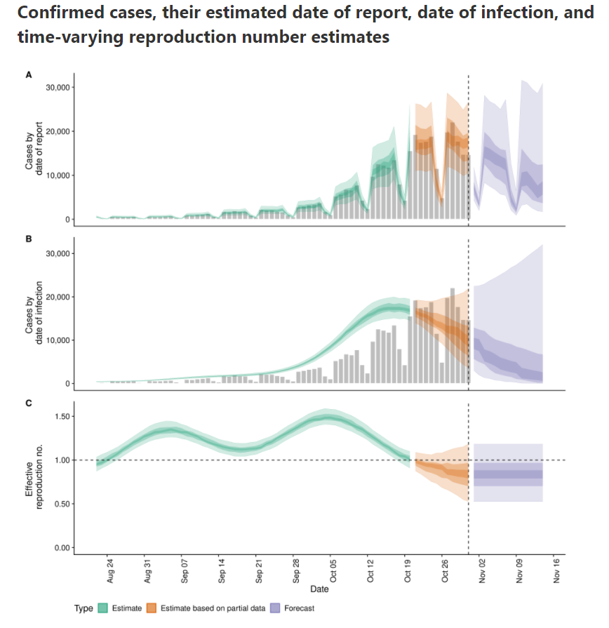
It's nice to see that the effective reproduction number ($Re(t)$) is again below one. That means the power of virus is declining and the number of infection will start to lower. This occured first on Tuesday 2020/11/3:
I estimated the $Re(t)$ earlier with rt.live model in this notebook. There the $Re(t)$ was still estimated to be above one. Michael Osthege replied with a simulation results with furter improved model:
In that estimation, the $Re(t)$ was also not yet heading below one at the end of october.
In this notebook, we will implement a calculation based on the method of the Robert Koch Institute. The method is described and programmed in R in this blog post.
Let's plot the number of cases in function of the time.
ax = df_cases_per_day.loc['Belgium'].plot(figsize=(18,6))
ax.set(ylabel='Number of cases', title='Number of cases for covid-19 and number of positives in Belgium');
We see that the last days are not yet complete. Let's cut off the last two days of reporting.
import datetime
from dateutil.relativedelta import relativedelta
Calculate the date two days ago:
datetime.date(2020, 11, 3)
datetime.date(2020, 11, 3)
# today_minus_two = datetime.date.today() + relativedelta(days=-2)
today_minus_two = datetime.date(2020, 11, 3) # Fix the day
today_minus_two.strftime("%Y-%m-%d")
'2020-11-03'
Replot the cases:
ax = df_cases_per_day.loc['Belgium'][:today_minus_two].plot(figsize=(18,6))
ax.set(ylabel='Number of cases', title='Number of cases for covid-19 and number of positives in Belgium');
Select the Belgium region:
region = 'Belgium'
df = df_cases_per_day.loc[region][:today_minus_two]
df
A basic method to calculate the effective reproduction number is described (among others) in this blogpost. I included the relevant paragraph:
In a recent report (an der Heiden and Hamouda 2020) the RKI described their method for computing R as part of the COVID-19 outbreak as follows (p. 13): For a constant generation time of 4 days, one obtains R
as the ratio of new infections in two consecutive time periods each consisting of 4 days. Mathematically, this estimation could be formulated as part of a statistical model:
Somewhat arbitrary, we denote by $Re(t)$ the above estimate for
R when $s=1$ corresponds to time $t-8$, i.e. we assign the obtained value to the last of the 8 values used in the computation.
In Python, we define a lambda function that we apply on a rolling window. Since indexes start from zero, we calculate:
The first values are Nan because the window is in the past. If we plot the result, it looks like this:
ax = df.rolling(8).apply(rt).plot(figsize=(16,4), label='Re(t)')
ax.set(ylabel='Re(t)', title='Effective reproduction number estimated with RKI method')
ax.legend(['Re(t)']);
To avoid the spikes due to weekend reporting issue, I first applied a rolling mean on a window of 7 days:
ax = df.rolling(7).mean().rolling(8).apply(rt).plot(figsize=(16,4), label='Re(t)')
ax.set(ylabel='Re(t)', title='Effective reproduction number estimated with RKI method after rolling mean on window of 7 days')
ax.legend(['Re(t)']);
import altair as alt

alt.Chart(df.rolling(7).mean().rolling(8).apply(rt).fillna(0).reset_index()).mark_line().encode(
    x=alt.X('date:T'),
    y=alt.Y('cases', title='Re(t)'),
    tooltip=['date:T', alt.Tooltip('cases', format='.2f')]
).transform_filter(
    alt.datum.date > alt.expr.toDate('2020-03-13')
).properties(
    width=600,
    title='Effective reproduction number in Belgium based on Robert-Koch Institute method'
)
Also, the more elaborated model from rtliveglobal is not yet that optimistic. Mind that model rtlive start estimating the $Re(t)$ from the number of tests instead of the number of cases. It might be that other reporting delays are involved.
epiforecast.io is already below 1 since beginning of November.
Another possiblity is that I made somewhere a mistake. If you spot it, please let me know.


 The rationale behind this improvement is discussed in her article: