"Reconstructing Economist graph with Altair"
"#30DayChartChallenge #altair #day12"
- image: images/Economist_stye%3B_30dayschartchallenge_day12.png
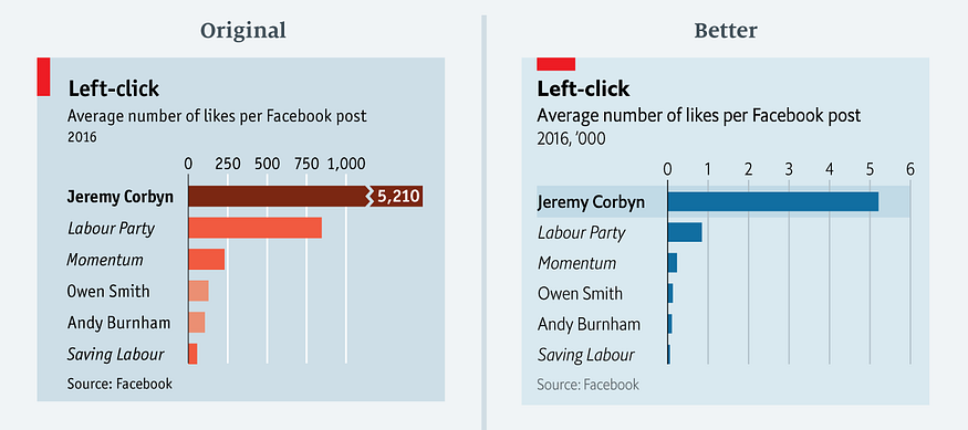
In an Economist article "The metamorphosis: How Jeremy Corbyn took control of Labour", the following graph appeared:
Later, Sarah Leo, data visualiser at The Economist, improved the graph to:
 The rationale behind this improvement is discussed in her article: 'Mistakes, we made a few'.
In this article, I show how visualisation library Altair can be used to reconstruct the improved graph.
Read the data for the graph into a Pandas dataframe:
This is how the data looks:
| Page | Average number of likes per Facebook post 2016 | |
|---|---|---|
| 0 | Jeremy Corbyn | 5210.0 |
| 1 | Labour Party | 845.0 |
| 2 | Momentum | 229.0 |
| 3 | Owen Smith | 127.0 |
| 4 | Andy Burnham | 105.0 |
| 5 | Saving Labour | 56.0 |
A standard bar graph in Altair gives this:
The message of the graph is that Jerermy Corbyn has by far the most likes per Facebook post in 2016. There are a number of improvements possible:
The number on the x-axis are multiple of thousands. In spirit of removing as much inkt as possible, let's rescale the x-asis with factor 1000. The label 'Page' on the y-axis is superfluous. Let's remove it.
After scaling the graphs looks like this:
alt.Chart(df).mark_bar().encode(
    x=alt.X('page1k', title='Average number of likes per Facebook post 2016'),
    y=alt.Y('Page:O', title='')
)
A third improvement is to sort the bars from high to low. This supports the message, Jeremy Corbyn has the most clicks.
alt.Chart(df).mark_bar().encode(
    x=alt.X('page1k:Q', title='Average number of likes per Facebook post 2016'),
    y=alt.Y('Page:O', title='', sort=alt.EncodingSortField(
            field="Average number of likes per Facebook post 2016:Q",  # The field to use for the sort
            op="sum",  # The operation to run on the field prior to sorting
            order="ascending"  # The order to sort in
        ))
)
Now, we see that we have to many ticks on the x-axis. We can add a scale and map the x-axis to integers to cope with that. While adding markup for the x-axis, we add orient='top'. That move the xlabel text to the top of the graph.
alt.Chart(df).mark_bar().encode(
    x=alt.X('page1k:Q', title='Average number of likes per Facebook post 2016',
            axis=alt.Axis(title='Average number of likes per Facebook post 2016', orient="top", format='d', values=[1,2,3,4,5,6]),
            scale=alt.Scale(round=True, domain=[0,6])),
    y=alt.Y('Page:O', title='', sort=alt.EncodingSortField(
            field="Average number of likes per Facebook post 2016:Q",  # The field to use for the sort
            op="sum",  # The operation to run on the field prior to sorting
            order="ascending"  # The order to sort in
        ))
)
Now, we want to remove the x-axis itself as it adds nothing extra. We do that by putting the stroke at None in the configure_view. We also adjust the x-axis title to make clear the numbers are multiples of thousands.
alt.Chart(df).mark_bar().encode(
    x=alt.X('page1k:Q', title="Average number of likes per Facebook post 2016  ('000)",
            axis=alt.Axis(title='Average number of likes per Facebook post 2016', orient="top", format='d', values=[1,2,3,4,5,6]),
            scale=alt.Scale(round=True, domain=[0,6])),
    y=alt.Y('Page:O', title='', sort=alt.EncodingSortField(
            field="Average number of likes per Facebook post 2016:Q",  # The field to use for the sort
            op="sum",  # The operation to run on the field prior to sorting
            order="ascending"  # The order to sort in
        ))
).configure_view(
    stroke=None, # Remove box around graph
)
Next we try to left align the y-axis labels:
alt.Chart(df).mark_bar().encode(
    x=alt.X('page1k:Q',
            axis=alt.Axis(title="Average number of likes per Facebook post 2016  ('000)", orient="top", format='d', values=[1,2,3,4,5,6]),
            scale=alt.Scale(round=True, domain=[0,6])),
    y=alt.Y('Page:O', title='', sort=alt.EncodingSortField(
            field="Average number of likes per Facebook post 2016:Q",  # The field to use for the sort
            op="sum",  # The operation to run on the field prior to sorting
            order="ascending"  # The order to sort in
        ))
).configure_view(
    stroke=None, # Remove box around graph
).configure_axisY(
    labelPadding=70,
    labelAlign='left'
)
Now, we apply the Economist style:
square = alt.Chart().mark_rect(width=50, height=18, color='#EB111A', xOffset=-105, yOffset=10)

bars = alt.Chart(df).mark_bar().encode(
    x=alt.X('page1k:Q',
            axis=alt.Axis(title="", orient="top", format='d', values=[1,2,3,4,5,6], labelFontSize=14),
            scale=alt.Scale(round=True, domain=[0,6])),
    y=alt.Y('Page:O', title='', sort=alt.EncodingSortField(
            field="Average number of likes per Facebook post 2016:Q",  # The field to use for the sort
            op="sum",  # The operation to run on the field prior to sorting
            order="ascending"  # The order to sort in
        ),
        # Based on https://stackoverflow.com/questions/66684882/color-some-x-labels-in-altair-plot
        axis=alt.Axis(labelFontSize=14, labelFontStyle=alt.condition('datum.value == "Jeremy Corbyn"', alt.value('bold'), alt.value('italic'))))
).properties(title={
      "text": ["Left Click", ],
      "subtitle": ["Average number of likes per Facebook post\n", "2016, '000"],
      "align": 'left',
      "anchor": 'start'
    }
)

source = alt.Chart(
    {"values": [{"text": "Source: Facebook"}]}
).mark_text(size=12, align='left', dx=-120, color='darkgrey').encode(
    text="text:N"
)

# from https://stackoverflow.com/questions/57244390/has-anyone-figured-out-a-workaround-to-add-a-subtitle-to-an-altair-generated-cha
chart = alt.vconcat(
    square,
    bars,
    source
).configure_concat(
    spacing=0
).configure(
    background='#D9E9F0'
).configure_view(
    stroke=None, # Remove box around graph
).configure_axisY(
    labelPadding=110,
    labelAlign='left',
    ticks=False,
    grid=False
).configure_title(
    fontSize=22,
    subtitleFontSize=18,
    offset=30,
    dy=30
)

chart
The only thing, I could not reproduce with Altair is the light bar around the the first label and bar. For those final touches I think it's better to export the graph and add those finishing touches with a tool such as Inkscape or Illustrator.
