Estimating the effective reproduction number in Belgium with the RKI method
Using the Robert Koch Institute method with serial interval of 4.


- Load libraries and data
- Robert Koch Institute method
- Interactive visualisation in Altair
- Making the final visualisation in Altair
Every day Bart Mesuere tweets a nice dashboard with current numbers about Covid-19 in Belgium. This was the tweet on Wednesday 20/11/04:
Gisteren waren er 877 nieuwe ziekenhuisopnames, een nieuw record na enkele betere dagen. Er liggen nu 7485 (+254) mensen in het ziekenhuis, waarvan 1351 (+49) op IC. Op zat. 31/10 waren er 5551 nieuwe bevestigde besmettingen, in de meeste provincies lijken we over de piek heen. pic.twitter.com/EOvnATQUaa
— Bart Mesuere (@BartMesuere) November 4, 2020
It's nice to see that the effective reproduction number ($Re(t)$) is again below one. That means the power of virus is declining and the number of infection will start to lower. This occured first on Tuesday 2020/11/3:
Gisteren waren er 596 nieuwe ziekenhuisopnames. Er liggen nu 7231 (+408) mensen in het ziekenhuis, waarvan 1302 (+79) op IC dit is meer dan tijdens de 1e golf. Op 30/10 waren er 14700 nieuwe bevestigde besmettingen. In Brussel en Brabant zien we ondertussen een duidelijke daling. pic.twitter.com/eWmhX20jQG
— Bart Mesuere (@BartMesuere) November 3, 2020
I estimated the $Re(t)$ earlier with rt.live model in this notebook. There the $Re(t)$ was still estimated to be above one. Michael Osthege replied with a simulation results with furter improved model:
Sneak preview of the results we got. @cast42 how do they compare with yours? Would love to see a contribution of your data loading routines to https://t.co/fCZDWUFd2k ! pic.twitter.com/QLEqZeV1qx
— Michael Osthege (@theCake) November 2, 2020
In that estimation, the $Re(t)$ was also not yet heading below one at the end of october.
In this notebook, we will implement a calculation based on the method of the Robert Koch Institute. The method is described and programmed in R in this blog post.
In that blogpost there's a link to a website with estimations for most places in the world The estimation for Belgium is here
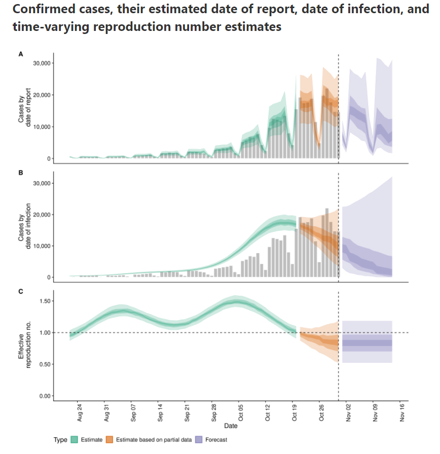
According to that calculation, $Re(t)$ is already below zero for some days.
import numpy as np
import pandas as pd
df_tests = pd.read_csv('https://epistat.sciensano.be/Data/COVID19BE_tests.csv', parse_dates=['DATE'])
df_cases = pd.read_csv('https://epistat.sciensano.be/Data/COVID19BE_CASES_AGESEX.csv', parse_dates=['DATE'])
df_cases
Reformat data into Rtlive format
df_cases_per_day = (df_cases
   .dropna(subset=['DATE'])
   .assign(region='Belgium')
   .groupby(['region', 'DATE'], as_index=False)
   .agg(cases=('CASES', 'sum'))
   .rename(columns={'DATE':'date'})
   .set_index(["region", "date"])
)
What's in our basetable:
df_cases_per_day
Let's plot the number of cases in function of the time.
ax = df_cases_per_day.loc['Belgium'].plot(figsize=(18,6))
ax.set(ylabel='Number of cases', title='Number of cases for covid-19 and number of positives in Belgium');

We see that the last days are not yet complete. Let's cut off the last two days of reporting.
import datetime
from dateutil.relativedelta import relativedelta
Calculate the date two days ago:
datetime.date(2020, 11, 3)
# today_minus_two = datetime.date.today() + relativedelta(days=-2)
today_minus_two = datetime.date(2020, 11, 3) # Fix the day
today_minus_two.strftime("%Y-%m-%d")
Replot the cases:
ax = df_cases_per_day.loc['Belgium'][:today_minus_two].plot(figsize=(18,6))
ax.set(ylabel='Number of cases', title='Number of cases for covid-19 and number of positives in Belgium');

Select the Belgium region:
region = 'Belgium'
df = df_cases_per_day.loc[region][:today_minus_two]
df
Check the types of the columns:
df.info()
Robert Koch Institute method
A basic method to calculate the effective reproduction number is described (among others) in this blogpost. I included the relevant paragraph:
In a recent report (an der Heiden and Hamouda 2020) the RKI described their method for computing R as part of the COVID-19 outbreak as follows (p. 13): For a constant generation time of 4 days, one obtains R as the ratio of new infections in two consecutive time periods each consisting of 4 days. Mathematically, this estimation could be formulated as part of a statistical model:
$$y_{s+4} | y_{s} \sim Po(R \cdot y_{s}), s= 1,2,3,4$$
where $y_{1}, \ldots, y_{4}$ are considered as fixed. From this we obtain
$$\hat{R}_{RKI} = \sum_{s=1}^{4} y_{s+4} / \sum_{s=1}^{4} y_{s}$$
Somewhat arbitrary, we denote by $Re(t)$ the above estimate for R when $s=1$ corresponds to time $t-8$, i.e. we assign the obtained value to the last of the 8 values used in the computation.
In Python, we define a lambda function that we apply on a rolling window. Since indexes start from zero, we calculate:
$$\hat{R}_{RKI} = \sum_{s=0}^{3} y_{s+4} / \sum_{s=0}^{3} y_{s}$$
rt = lambda y: np.sum(y[4:])/np.sum(y[:4])
df.rolling(8).apply(rt)
The first values are Nan because the window is in the past. If we plot the result, it looks like this:
ax = df.rolling(8).apply(rt).plot(figsize=(16,4), label='Re(t)')
ax.set(ylabel='Re(t)', title='Effective reproduction number estimated with RKI method')
ax.legend(['Re(t)']);

To avoid the spikes due to weekend reporting issue, I first applied a rolling mean on a window of 7 days:
ax = df.rolling(7).mean().rolling(8).apply(rt).plot(figsize=(16,4), label='Re(t)')
ax.set(ylabel='Re(t)', title='Effective reproduction number estimated with RKI method after rolling mean on window of 7 days')
ax.legend(['Re(t)']);

import altair as alt

alt.Chart(df.rolling(7).mean().rolling(8).apply(rt).fillna(0).reset_index()).mark_line().encode(
    x=alt.X('date:T'),
    y=alt.Y('cases', title='Re(t)'),
    tooltip=['date:T', alt.Tooltip('cases', format='.2f')]
).transform_filter(
    alt.datum.date > alt.expr.toDate('2020-03-13')
).properties(
    width=600,
    title='Effective reproduction number in Belgium based on Robert-Koch Institute method'
)
#collapse

df_plot = df.rolling(7).mean().rolling(8).apply(rt).fillna(0).reset_index()
last_value = str(df_plot.iloc[-1]['cases'].round(2)) + ' ↓'
first_value = str(df_plot[df_plot['date'] == '2020-10-21'].iloc[0]['cases'].round(2)) # + ' ↑'
today_minus_15 = datetime.datetime.today() + relativedelta(days=-15)
today_minus_15_str = today_minus_15.strftime("%Y-%m-%d")

line = alt.Chart(df_plot).mark_line(point=True).encode(
    x=alt.X('date:T', axis=alt.Axis(title='Datum', grid=False)),
    y=alt.Y('cases', axis=alt.Axis(title='Re(t)', grid=False, labels=False, titlePadding=40)),
    tooltip=['date:T', alt.Tooltip('cases', title='Re(t)', format='.2f')]
).transform_filter(
    alt.datum.date > alt.expr.toDate(today_minus_15_str)
).properties(
    width=600,
    height=100
)

hline = alt.Chart(pd.DataFrame({'cases': [1]})).mark_rule().encode(y='cases')


label_right = alt.Chart(df_plot).mark_text(
    align='left', dx=5, dy=-10 , size=15
).encode(
    x=alt.X('max(date):T', title=None),
    text=alt.value(last_value),
)

label_left = alt.Chart(df_plot).mark_text(
    align='right', dx=-5, dy=-40, size=15
).encode(
    x=alt.X('min(date):T', title=None),
    text=alt.value(first_value),
).transform_filter(
    alt.datum.date > alt.expr.toDate(today_minus_15_str)
)

source = alt.Chart(
    {"values": [{"text": "Data source: Sciensano"}]}
).mark_text(size=12, align='left', dx=-57).encode(
    text="text:N"
)

alt.vconcat(line + label_left + label_right + hline, source).configure(
    background='#D9E9F0'
).configure_view(
    stroke=None, # Remove box around graph
).configure_axisY(
    ticks=False,
    grid=False,
    domain=False
).configure_axisX(
    grid=False,
    domain=False
).properties(title={
      "text": ['Effective reproduction number for the last 14 days in Belgium'],
      "subtitle": [f'Estimation based on the number of cases until {today_minus_two.strftime("%Y-%m-%d")} after example of Robert Koch Institute with serial interval of 4'],
}
)
# .configure_axisY(
#     labelPadding=50,
# )
To check the calculation, here are the last for values for the number of cases after applying the mean window of 7:
df.rolling(7).mean().iloc[-8:-4]
Those must be added together:
df.rolling(7).mean().iloc[-8:-4].sum()
And here are the four values, starting four days ago:
df.rolling(7).mean().iloc[-4:]
These are added together:
df.rolling(7).mean().iloc[-4:].sum()
And now we divide those two sums to get the $Re(t)$ of 2020-11-03:
df.rolling(7).mean().iloc[-4:].sum()/df.rolling(7).mean().iloc[-8:-4].sum()
This matches (as expected) the value in the graph. Let's compare with three other sources:
- Alas it does not match the calculation reported by Bart Mesuere on 2020-11-03 based on the RKI model that reports 0.96:
Gisteren waren er 596 nieuwe ziekenhuisopnames. Er liggen nu 7231 (+408) mensen in het ziekenhuis, waarvan 1302 (+79) op IC dit is meer dan tijdens de 1e golf. Op 30/10 waren er 14700 nieuwe bevestigde besmettingen. In Brussel en Brabant zien we ondertussen een duidelijke daling. pic.twitter.com/eWmhX20jQG
— Bart Mesuere (@BartMesuere) November 3, 2020 -
Also, the more elaborated model from rtliveglobal is not yet that optimistic. Mind that model rtlive start estimating the $Re(t)$ from the number of tests instead of the number of cases. It might be that other reporting delays are involved.
-
epiforecast.io is already below 1 since beginning of November.
Another possiblity is that I made somewhere a mistake. If you spot it, please let me know.