Reconstructing Economist graph with Altair
#30DayChartChallenge #altair #day12
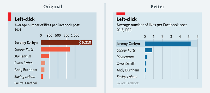
In an Economist article "The metamorphosis: How Jeremy Corbyn took control of Labour", the following graph appeared:

Later, Sarah Leo, data visualiser at The Economist, improved the graph to:
 The rationale behind this improvement is discussed in her article: 'Mistakes, we made a few'.
In this article, I show how visualisation library Altair can be used to reconstruct the improved graph.
import numpy as np
import pandas as pd
import altair as alt
Read the data for the graph into a Pandas dataframe:
df = pd.read_csv('http://infographics.economist.com/databank/Economist_corbyn.csv').dropna()
This is how the data looks:
df
A standard bar graph in Altair gives this:
alt.Chart(df).mark_bar().encode(
    x='Average number of likes per Facebook post 2016:Q',
    y='Page:O'
)
The message of the graph is that Jerermy Corbyn has by far the most likes per Facebook post in 2016. There are a number of improvements possible:
The number on the x-axis are multiple of thousands. In spirit of removing as much inkt as possible, let's rescale the x-asis with factor 1000. The label 'Page' on the y-axis is superfluous. Let's remove it.
df['page1k'] = df['Average number of likes per Facebook post 2016']/1000.0
After scaling the graphs looks like this:
alt.Chart(df).mark_bar().encode(
    x=alt.X('page1k', title='Average number of likes per Facebook post 2016'),
    y=alt.Y('Page:O', title='')
)
A third improvement is to sort the bars from high to low. This supports the message, Jeremy Corbyn has the most clicks.
alt.Chart(df).mark_bar().encode(
    x=alt.X('page1k:Q', title='Average number of likes per Facebook post 2016'),
    y=alt.Y('Page:O', title='', sort=alt.EncodingSortField(
            field="Average number of likes per Facebook post 2016:Q",  # The field to use for the sort
            op="sum",  # The operation to run on the field prior to sorting
            order="ascending"  # The order to sort in
        ))
)
Now, we see that we have to many ticks on the x-axis. We can add a scale and map the x-axis to integers to cope with that. While adding markup for the x-axis, we add orient='top'. That move the xlabel text to the top of the graph.
alt.Chart(df).mark_bar().encode(
    x=alt.X('page1k:Q', title='Average number of likes per Facebook post 2016',
            axis=alt.Axis(title='Average number of likes per Facebook post 2016', orient="top", format='d', values=[1,2,3,4,5,6]),
            scale=alt.Scale(round=True, domain=[0,6])),
    y=alt.Y('Page:O', title='', sort=alt.EncodingSortField(
            field="Average number of likes per Facebook post 2016:Q",  # The field to use for the sort
            op="sum",  # The operation to run on the field prior to sorting
            order="ascending"  # The order to sort in
        ))
)
Now, we want to remove the x-axis itself as it adds nothing extra. We do that by putting the stroke at None in the configure_view. We also adjust the x-axis title to make clear the numbers are multiples of thousands.
alt.Chart(df).mark_bar().encode(
    x=alt.X('page1k:Q', title="Average number of likes per Facebook post 2016  ('000)",
            axis=alt.Axis(title='Average number of likes per Facebook post 2016', orient="top", format='d', values=[1,2,3,4,5,6]),
            scale=alt.Scale(round=True, domain=[0,6])),
    y=alt.Y('Page:O', title='', sort=alt.EncodingSortField(
            field="Average number of likes per Facebook post 2016:Q",  # The field to use for the sort
            op="sum",  # The operation to run on the field prior to sorting
            order="ascending"  # The order to sort in
        ))
).configure_view(
    stroke=None, # Remove box around graph
)
Next we try to left align the y-axis labels:
alt.Chart(df).mark_bar().encode(
    x=alt.X('page1k:Q',
            axis=alt.Axis(title="Average number of likes per Facebook post 2016  ('000)", orient="top", format='d', values=[1,2,3,4,5,6]),
            scale=alt.Scale(round=True, domain=[0,6])),
    y=alt.Y('Page:O', title='', sort=alt.EncodingSortField(
            field="Average number of likes per Facebook post 2016:Q",  # The field to use for the sort
            op="sum",  # The operation to run on the field prior to sorting
            order="ascending"  # The order to sort in
        ))
).configure_view(
    stroke=None, # Remove box around graph
).configure_axisY(
    labelPadding=70,
    labelAlign='left'
)
Now, we apply the Economist style:
square = alt.Chart().mark_rect(width=50, height=18, color='#EB111A', xOffset=-105, yOffset=10)

bars = alt.Chart(df).mark_bar().encode(
    x=alt.X('page1k:Q',
            axis=alt.Axis(title="", orient="top", format='d', values=[1,2,3,4,5,6], labelFontSize=14),
            scale=alt.Scale(round=True, domain=[0,6])),
    y=alt.Y('Page:O', title='', sort=alt.EncodingSortField(
            field="Average number of likes per Facebook post 2016:Q",  # The field to use for the sort
            op="sum",  # The operation to run on the field prior to sorting
            order="ascending"  # The order to sort in
        ),
        # Based on https://stackoverflow.com/questions/66684882/color-some-x-labels-in-altair-plot
        axis=alt.Axis(labelFontSize=14, labelFontStyle=alt.condition('datum.value == "Jeremy Corbyn"', alt.value('bold'), alt.value('italic'))))
).properties(title={
      "text": ["Left Click", ],
      "subtitle": ["Average number of likes per Facebook post\n", "2016, '000"],
      "align": 'left',
      "anchor": 'start'
    }
)

source = alt.Chart(
    {"values": [{"text": "Source: Facebook"}]}
).mark_text(size=12, align='left', dx=-120, color='darkgrey').encode(
    text="text:N"
)

# from https://stackoverflow.com/questions/57244390/has-anyone-figured-out-a-workaround-to-add-a-subtitle-to-an-altair-generated-cha
chart = alt.vconcat(
    square,
    bars,
    source
).configure_concat(
    spacing=0
).configure(
    background='#D9E9F0'
).configure_view(
    stroke=None, # Remove box around graph
).configure_axisY(
    labelPadding=110,
    labelAlign='left',
    ticks=False,
    grid=False
).configure_title(
    fontSize=22,
    subtitleFontSize=18,
    offset=30,
    dy=30
)

chart
The only thing, I could not reproduce with Altair is the light bar around the the first label and bar. For those final touches I think it's better to export the graph and add those finishing touches with a tool such as Inkscape or Illustrator.