Bullet chart in python Altair
How to make bullet charts with Altair


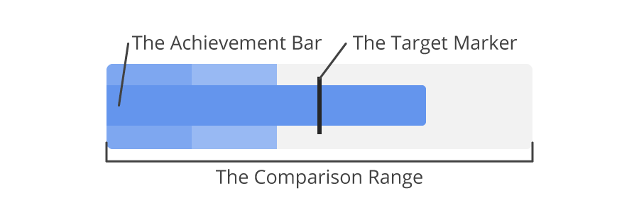
In the article "Bullet Charts - What Is It And How To Use It" I learned about Bullet charts. It's a specific kind of barchart that must convey the state of a measure or KPI. The goal is to see in a glance if the target is met. Here is an example bullet chart from the article:
# This causes issues to:
# from IPython.display import Image
# Image('https://jscharting.com/blog/bullet-charts/images/bullet_components.png')
# <img src="https://jscharting.com/blog/bullet-charts/images/bullet_components.png" alt="Bullet chart" style="width: 200px;"/>
Below is some Python code that generates bullets graphs using the Altair library.
import altair as alt
import pandas as pd

df = pd.DataFrame.from_records([
    {"title":"Revenue","subtitle":"US$, in thousands","ranges":[150,225,300],"measures":[220,270],"markers":[250]},
    {"title":"Profit","subtitle":"%","ranges":[20,25,30],"measures":[21,23],"markers":[26]},
    {"title":"Order Size","subtitle":"US$, average","ranges":[350,500,600],"measures":[100,320],"markers":[550]},
    {"title":"New Customers","subtitle":"count","ranges":[1400,2000,2500],"measures":[1000,1650],"markers":[2100]},
    {"title":"Satisfaction","subtitle":"out of 5","ranges":[3.5,4.25,5],"measures":[3.2,4.7],"markers":[4.4]}
])

alt.layer(
    alt.Chart().mark_bar(color='#eee').encode(alt.X("ranges[2]:Q", scale=alt.Scale(nice=False), title=None)),
    alt.Chart().mark_bar(color='#ddd').encode(x="ranges[1]:Q"),
    alt.Chart().mark_bar(color='#bbb').encode(x="ranges[0]:Q"),
    alt.Chart().mark_bar(color='steelblue', size=10).encode(x='measures[0]:Q'),
    alt.Chart().mark_tick(color='black', size=12).encode(x='markers[0]:Q'),
    data=df
).facet(
    row=alt.Row("title:O", title='')
).resolve_scale(
    x='independent'
)