Estimating the effective reproduction number in Belgium with the RKI method
Using the Robert Koch Institute method with serial interval of 4.
Every day Bart Mesuere tweets a nice dashboard with current numbers about Covid-19 in Belgium. This was the tweet on Wednesday 20/11/04:
twitter: https://twitter.com/BartMesuere/status/1323881489864548352
It's nice to see that the effective reproduction number (\(Re(t)\)) is again below one. That means the power of virus is declining and the number of infection will start to lower. This occured first on Tuesday 2020/11/3:
twitter: https://twitter.com/BartMesuere/status/1323519613855059968
I estimated the \(Re(t)\) earlier with rt.live model in this notebook. There the \(Re(t)\) was still estimated to be above one. Michael Osthege replied with a simulation results with furter improved model:
twitter: https://twitter.com/theCake/status/1323211910481874944
In that estimation, the \(Re(t)\) was also not yet heading below one at the end of october.
In this notebook, we will implement a calculation based on the method of the Robert Koch Institute. The method is described and programmed in R in this blog post.
In that blogpost there's a link to a website with estimations for most places in the world The estimation for Belgium is here
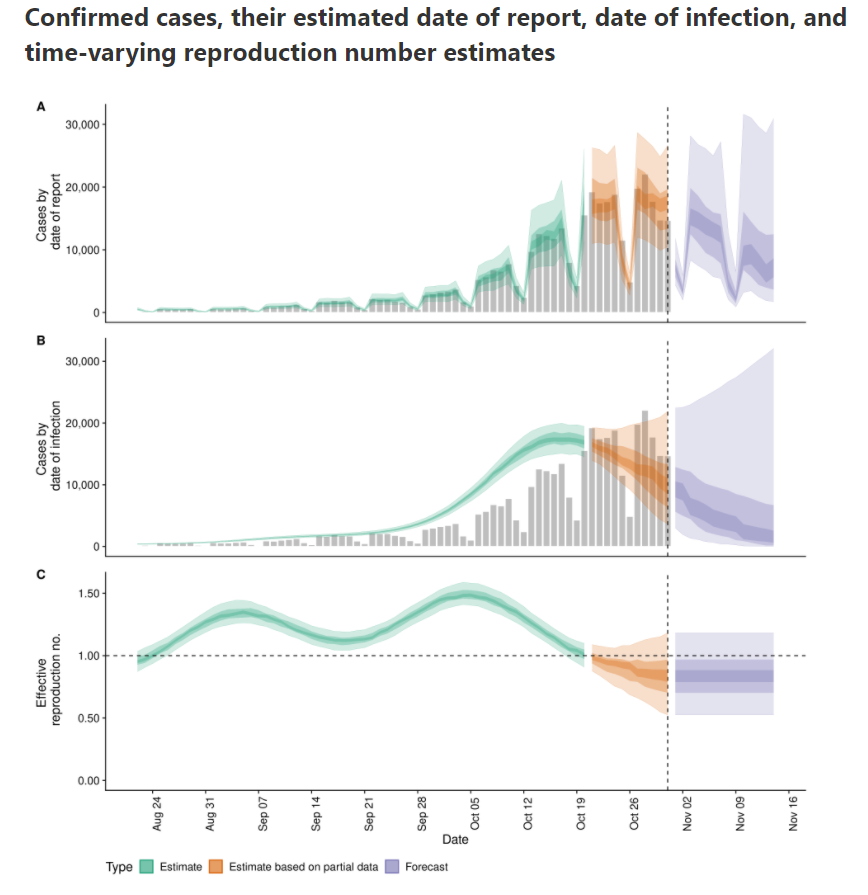
According to that calculation, \(Re(t)\) is already below zero for some days.
Load libraries and data
df_tests = pd.read_csv('https://epistat.sciensano.be/Data/COVID19BE_tests.csv', parse_dates=['DATE'])
df_cases = pd.read_csv('https://epistat.sciensano.be/Data/COVID19BE_CASES_AGESEX.csv', parse_dates=['DATE'])
df_cases
| DATE | PROVINCE | REGION | AGEGROUP | SEX | CASES | |
|---|---|---|---|---|---|---|
| 0 | 2020-03-01 | Antwerpen | Flanders | 40-49 | M | 1 |
| 1 | 2020-03-01 | Brussels | Brussels | 10-19 | F | 1 |
| 2 | 2020-03-01 | Brussels | Brussels | 10-19 | M | 1 |
| 3 | 2020-03-01 | Brussels | Brussels | 20-29 | M | 1 |
| 4 | 2020-03-01 | Brussels | Brussels | 30-39 | F | 1 |
| ... | ... | ... | ... | ... | ... | ... |
| 36279 | NaT | VlaamsBrabant | Flanders | 40-49 | M | 3 |
| 36280 | NaT | VlaamsBrabant | Flanders | 50-59 | M | 1 |
| 36281 | NaT | WestVlaanderen | Flanders | 20-29 | F | 1 |
| 36282 | NaT | WestVlaanderen | Flanders | 50-59 | M | 3 |
| 36283 | NaT | NaN | NaN | NaN | NaN | 1 |
36284 rows × 6 columns
Reformat data into Rtlive format
df_cases_per_day = (df_cases
   .dropna(subset=['DATE'])
   .assign(region='Belgium')
   .groupby(['region', 'DATE'], as_index=False)
   .agg(cases=('CASES', 'sum'))
   .rename(columns={'DATE':'date'})
   .set_index(["region", "date"])
)
What's in our basetable:
| cases | ||
|---|---|---|
| region | date | |
| Belgium | 2020-03-01 | 19 |
| 2020-03-02 | 19 | |
| 2020-03-03 | 34 | |
| 2020-03-04 | 53 | |
| 2020-03-05 | 81 | |
| ... | ... | |
| 2020-11-01 | 2660 | |
| 2020-11-02 | 13345 | |
| 2020-11-03 | 11167 | |
| 2020-11-04 | 4019 | |
| 2020-11-05 | 5 |
250 rows × 1 columns
Let's plot the number of cases in function of the time.
ax = df_cases_per_day.loc['Belgium'].plot(figsize=(18,6))
ax.set(ylabel='Number of cases', title='Number of cases for covid-19 and number of positives in Belgium');
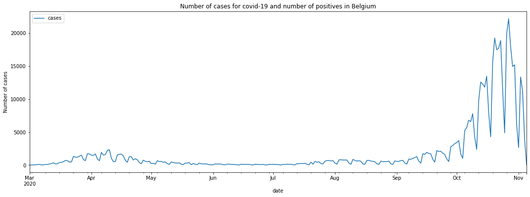
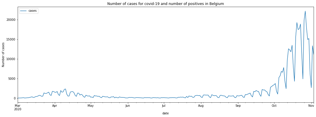
We see that the last days are not yet complete. Let's cut off the last two days of reporting.
Calculate the date two days ago:
datetime.date(2020, 11, 3)
# today_minus_two = datetime.date.today() + relativedelta(days=-2)
today_minus_two = datetime.date(2020, 11, 3) # Fix the day
today_minus_two.strftime("%Y-%m-%d")
'2020-11-03'
Replot the cases:
ax = df_cases_per_day.loc['Belgium'][:today_minus_two].plot(figsize=(18,6))
ax.set(ylabel='Number of cases', title='Number of cases for covid-19 and number of positives in Belgium');
Select the Belgium region:
| cases | |
|---|---|
| date | |
| 2020-03-01 | 19 |
| 2020-03-02 | 19 |
| 2020-03-03 | 34 |
| 2020-03-04 | 53 |
| 2020-03-05 | 81 |
| ... | ... |
| 2020-10-30 | 15185 |
| 2020-10-31 | 6243 |
| 2020-11-01 | 2660 |
| 2020-11-02 | 13345 |
| 2020-11-03 | 11167 |
248 rows × 1 columns
Check the types of the columns:
<class 'pandas.core.frame.DataFrame'>
DatetimeIndex: 248 entries, 2020-03-01 to 2020-11-03
Data columns (total 1 columns):
 #   Column  Non-Null Count  Dtype
---  ------  --------------  -----
 0   cases   248 non-null    int64
dtypes: int64(1)
memory usage: 3.9 KB
Robert Koch Institute method
A basic method to calculate the effective reproduction number is described (among others) in this blogpost. I included the relevant paragraph:
In a recent report (an der Heiden and Hamouda 2020) the RKI described their method for computing R as part of the COVID-19 outbreak as follows (p. 13): For a constant generation time of 4 days, one obtains R as the ratio of new infections in two consecutive time periods each consisting of 4 days. Mathematically, this estimation could be formulated as part of a statistical model:
where \(y_{1}, \ldots, y_{4}\) are considered as fixed. From this we obtain
Somewhat arbitrary, we denote by \(Re(t)\) the above estimate for R when \(s=1\) corresponds to time \(t-8\), i.e. we assign the obtained value to the last of the 8 values used in the computation.
In Python, we define a lambda function that we apply on a rolling window. Since indexes start from zero, we calculate:
| cases | |
|---|---|
| date | |
| 2020-03-01 | NaN |
| 2020-03-02 | NaN |
| 2020-03-03 | NaN |
| 2020-03-04 | NaN |
| 2020-03-05 | NaN |
| ... | ... |
| 2020-10-30 | 1.273703 |
| 2020-10-31 | 0.929291 |
| 2020-11-01 | 0.601838 |
| 2020-11-02 | 0.499806 |
| 2020-11-03 | 0.475685 |
248 rows × 1 columns
The first values are Nan because the window is in the past. If we plot the result, it looks like this:
ax = df.rolling(8).apply(rt).plot(figsize=(16,4), label='Re(t)')
ax.set(ylabel='Re(t)', title='Effective reproduction number estimated with RKI method')
ax.legend(['Re(t)']);
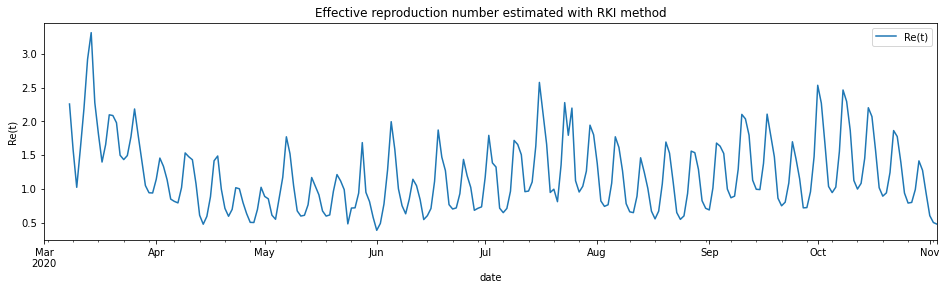
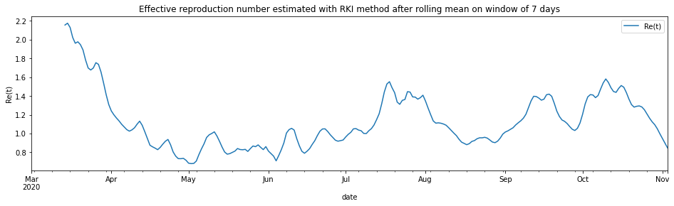
To avoid the spikes due to weekend reporting issue, I first applied a rolling mean on a window of 7 days:
ax = df.rolling(7).mean().rolling(8).apply(rt).plot(figsize=(16,4), label='Re(t)')
ax.set(ylabel='Re(t)', title='Effective reproduction number estimated with RKI method after rolling mean on window of 7 days')
ax.legend(['Re(t)']);
Interactive visualisation in Altair
import altair as alt

alt.Chart(df.rolling(7).mean().rolling(8).apply(rt).fillna(0).reset_index()).mark_line().encode(
    x=alt.X('date:T'),
    y=alt.Y('cases', title='Re(t)'),
    tooltip=['date:T', alt.Tooltip('cases', format='.2f')]
).transform_filter(
    alt.datum.date > alt.expr.toDate('2020-03-13')
).properties(
    width=600,
    title='Effective reproduction number in Belgium based on Robert-Koch Institute method'
)
Making the final visualisation in Altair
In the interactive Altair figure below, we show the \(Re(t)\) for the last 14 days. We reduce the rolling mean window to three to see faster reactions.
#collapse

df_plot = df.rolling(7).mean().rolling(8).apply(rt).fillna(0).reset_index()
last_value = str(df_plot.iloc[-1]['cases'].round(2)) + ' ↓'
first_value = str(df_plot[df_plot['date'] == '2020-10-21'].iloc[0]['cases'].round(2)) # + ' ↑'
today_minus_15 = datetime.datetime.today() + relativedelta(days=-15)
today_minus_15_str = today_minus_15.strftime("%Y-%m-%d")

line = alt.Chart(df_plot).mark_line(point=True).encode(
    x=alt.X('date:T', axis=alt.Axis(title='Datum', grid=False)),
    y=alt.Y('cases', axis=alt.Axis(title='Re(t)', grid=False, labels=False, titlePadding=40)),
    tooltip=['date:T', alt.Tooltip('cases', title='Re(t)', format='.2f')]
).transform_filter(
    alt.datum.date > alt.expr.toDate(today_minus_15_str)
).properties(
    width=600,
    height=100
)

hline = alt.Chart(pd.DataFrame({'cases': [1]})).mark_rule().encode(y='cases')


label_right = alt.Chart(df_plot).mark_text(
    align='left', dx=5, dy=-10 , size=15
).encode(
    x=alt.X('max(date):T', title=None),
    text=alt.value(last_value),
)

label_left = alt.Chart(df_plot).mark_text(
    align='right', dx=-5, dy=-40, size=15
).encode(
    x=alt.X('min(date):T', title=None),
    text=alt.value(first_value),
).transform_filter(
    alt.datum.date > alt.expr.toDate(today_minus_15_str)
)

source = alt.Chart(
    {"values": [{"text": "Data source: Sciensano"}]}
).mark_text(size=12, align='left', dx=-57).encode(
    text="text:N"
)

alt.vconcat(line + label_left + label_right + hline, source).configure(
    background='#D9E9F0'
).configure_view(
    stroke=None, # Remove box around graph
).configure_axisY(
    ticks=False,
    grid=False,
    domain=False
).configure_axisX(
    grid=False,
    domain=False
).properties(title={
      "text": ['Effective reproduction number for the last 14 days in Belgium'],
      "subtitle": [f'Estimation based on the number of cases until {today_minus_two.strftime("%Y-%m-%d")} after example of Robert Koch Institute with serial interval of 4'],
}
)
# .configure_axisY(
#     labelPadding=50,
# )
To check the calculation, here are the last for values for the number of cases after applying the mean window of 7:
| cases | |
|---|---|
| date | |
| 2020-10-27 | 16067.571429 |
| 2020-10-28 | 16135.857143 |
| 2020-10-29 | 15744.571429 |
| 2020-10-30 | 15218.000000 |
Those must be added together:
cases    63166.0
dtype: float64
And here are the four values, starting four days ago:
| cases | |
|---|---|
| date | |
| 2020-10-31 | 14459.428571 |
| 2020-11-01 | 14140.428571 |
| 2020-11-02 | 13213.428571 |
| 2020-11-03 | 11641.428571 |
These are added together:
cases    53454.714286
dtype: float64
And now we divide those two sums to get the \(Re(t)\) of 2020-11-03:
cases    0.846258
dtype: float64
This matches (as expected) the value in the graph. Let's compare with three other sources:
- Alas it does not match the calculation reported by Bart Mesuere on 2020-11-03 based on the RKI model that reports 0.96:
twitter: https://twitter.com/BartMesuere/status/1323519613855059968
-
Also, the more elaborated model from rtliveglobal is not yet that optimistic. Mind that model rtlive start estimating the \(Re(t)\) from the number of tests instead of the number of cases. It might be that other reporting delays are involved.
-
epiforecast.io is already below 1 since beginning of November.
Another possiblity is that I made somewhere a mistake. If you spot it, please let me know.