"Bar chart made in Altair with Financial Times style"
"#30DayChartChallenge #Day24 Themeday: Financial times"
- image: images/barchart_FT_style_altair.png
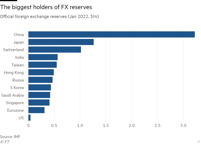
The #30DayChartChallenge Day 24 calls for Financial Times themed charts. The bar chart that I will try to reproduce in Altair was published in the article: "Financial warfare: will there be a backlash against the dollar?"
This is the graph (without FT background) to we want to reproduce:

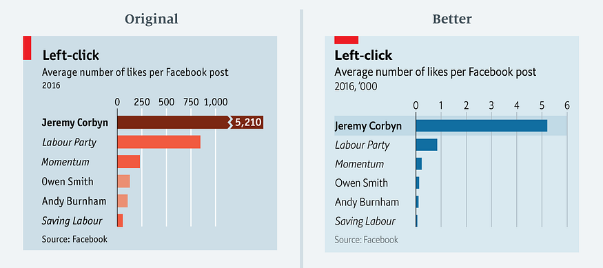 The rationale behind this improvement is discussed in her article: