2020
Estimating the effective reproduction number in Belgium with the RKI method
Using the Robert Koch Institute method with serial interval of 4.
Every day Bart Mesuere tweets a nice dashboard with current numbers about Covid-19 in Belgium. This was the tweet on Wednesday 20/11/04:
twitter: https://twitter.com/BartMesuere/status/1323881489864548352
It's nice to see that the effective reproduction number (\(Re(t)\)) is again below one. That means the power of virus is declining and the number of infection will start to lower. This occured first on Tuesday 2020/11/3:
twitter: https://twitter.com/BartMesuere/status/1323519613855059968
I estimated the \(Re(t)\) earlier with rt.live model in this notebook. There the \(Re(t)\) was still estimated to be above one. Michael Osthege replied with a simulation results with furter improved model:
twitter: https://twitter.com/theCake/status/1323211910481874944
In that estimation, the \(Re(t)\) was also not yet heading below one at the end of october.
In this notebook, we will implement a calculation based on the method of the Robert Koch Institute. The method is described and programmed in R in this blog post.
In that blogpost there's a link to a website with estimations for most places in the world The estimation for Belgium is here
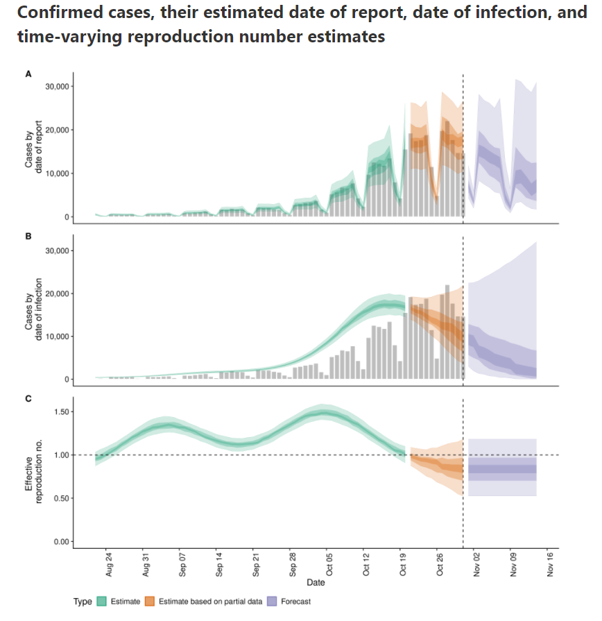
According to that calculation, \(Re(t)\) is already below zero for some days.
My talk at data science leuven
Links to video and slides of the talk and thanking people.
Talk material
On 23 April 2020, I was invited for a talk at Data science Leuven. I talked about how you can explore and explain the results of a clustering exercise. The target audience are data scientists that that have notions of how to cluster data and that want to improve their skills.
Regional covid-19 mortality in Belgium per gender and age
Combines the mortality number of the last 10 year with those of covid-19 this year.
Daily covid-19 Deaths compared to average deaths the last 10 years
"In this blogpost we try to get an idea of how many extra deaths we have in Belgium due to covid-19 compared to the average we had the last 10 years."
First test post
Testing a simple notebook for publishing with fastpages
Evolution of burglary in Leuven. Is the trend downwards ?
Evolution of burglary in Leuven. Is the trend downwards ?
The local police shared a graph with the number of break-ins in Leuven per year. The article shows a graph with a downwards trendline. Can we conclude that the number of breakins is showing a downward trend based on those numbers? Let's construct a dataframe with the data from the graph.
Bullet chart in python Altair
How to make bullet charts with Altair
In the article "Bullet Charts - What Is It And How To Use It" I learned about Bullet charts. It's a specific kind of barchart that must convey the state of a measure or KPI. The goal is to see in a glance if the target is met. Here is an example bullet chart from the article: