Hello world
I see a post on bluesky from Vincent Warmerdam: https://bsky.app/profile/koaning.bsky.social/post/3lkgsicxmhj2z
He vibe coded a blogpost editor. That sparked me to revamp my old Fastpages blog: https://cast42.github.io/fastpages-blog/
I see a post on bluesky from Vincent Warmerdam: https://bsky.app/profile/koaning.bsky.social/post/3lkgsicxmhj2z
He vibe coded a blogpost editor. That sparked me to revamp my old Fastpages blog: https://cast42.github.io/fastpages-blog/
I copied the idea from https://github.com/koaning/flask-blogposter/tree/main
and vibe coded it into a FlaskAPI app.
"#30DayChartChallenge #Day24 Themeday: Financial times"
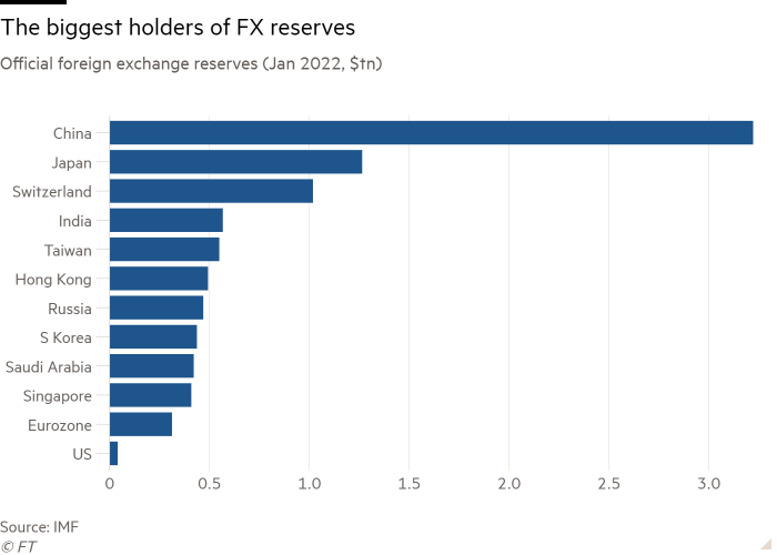
The #30DayChartChallenge Day 24 calls for Financial Times themed charts. The bar chart that I will try to reproduce in Altair was published in the article: "Financial warfare: will there be a backlash against the dollar?"
This is the graph (without FT background) to we want to reproduce:
"#30DayChartChallenge #altair #day12"
In an Economist article "The metamorphosis: How Jeremy Corbyn took control of Labour", the following graph appeared:

Later, Sarah Leo, data visualiser at The Economist, improved the graph to:
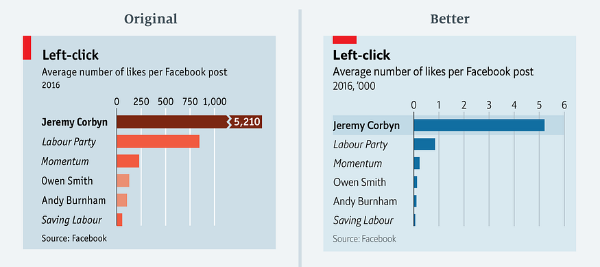 The rationale behind this improvement is discussed in her article: 'Mistakes, we made a few'.
In this article, I show how visualisation library Altair can be used to reconstruct the improved graph.
Using the Robert Koch Institute method with serial interval of 4.
Every day Bart Mesuere tweets a nice dashboard with current numbers about Covid-19 in Belgium. This was the tweet on Wednesday 20/11/04:
twitter: https://twitter.com/BartMesuere/status/1323881489864548352
It's nice to see that the effective reproduction number (\(Re(t)\)) is again below one. That means the power of virus is declining and the number of infection will start to lower. This occured first on Tuesday 2020/11/3:
twitter: https://twitter.com/BartMesuere/status/1323519613855059968
I estimated the \(Re(t)\) earlier with rt.live model in this notebook. There the \(Re(t)\) was still estimated to be above one. Michael Osthege replied with a simulation results with furter improved model:
twitter: https://twitter.com/theCake/status/1323211910481874944
In that estimation, the \(Re(t)\) was also not yet heading below one at the end of october.
In this notebook, we will implement a calculation based on the method of the Robert Koch Institute. The method is described and programmed in R in this blog post.
In that blogpost there's a link to a website with estimations for most places in the world The estimation for Belgium is here
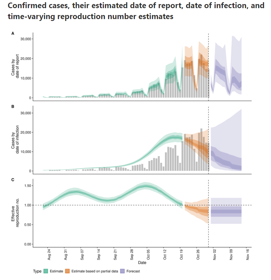
According to that calculation, \(Re(t)\) is already below zero for some days.
Links to video and slides of the talk and thanking people.
On 23 April 2020, I was invited for a talk at Data science Leuven. I talked about how you can explore and explain the results of a clustering exercise. The target audience are data scientists that that have notions of how to cluster data and that want to improve their skills.
Combines the mortality number of the last 10 year with those of covid-19 this year.
"In this blogpost we try to get an idea of how many extra deaths we have in Belgium due to covid-19 compared to the average we had the last 10 years."
Testing a simple notebook for publishing with fastpages